MANIFESTO - Design Ideas
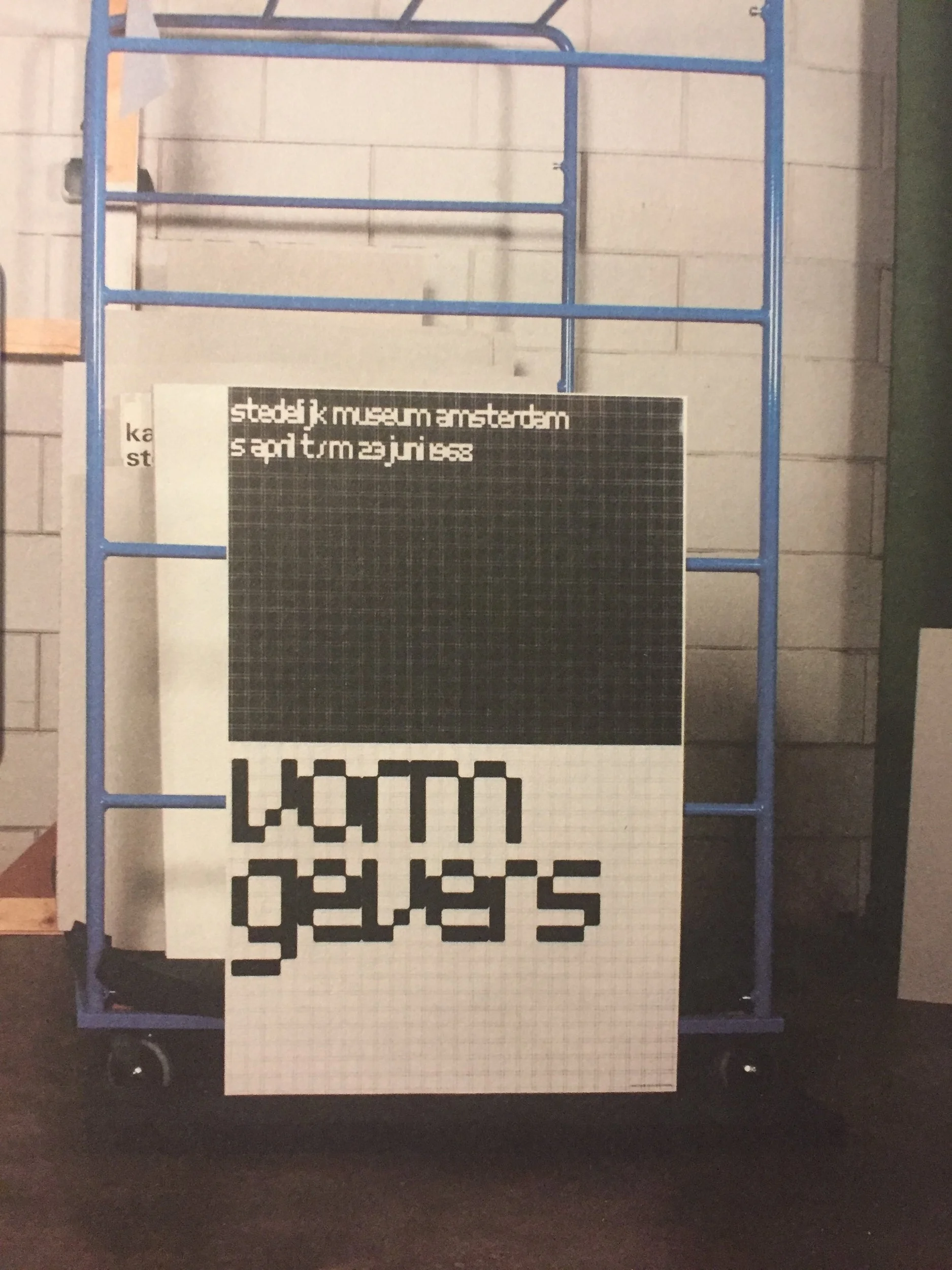
“That gave me the idea of making the grid visible for the first time. I did this to show my way of designing, and that fitted into the whole idea behind the exhibition”.
Crouwel, W. (2011). Wim Crouwel: A Graphic Odyssey. Intervieved by Tony Brook.
Wim Crouwel is talking here about his 1968 poster ‘Vormgevers’ to promote an industrial design exhibition. He wanted to make his working grid visible for the audience in order for them to see his method of working and I think that this would be a perfect technique for me to use in my design.
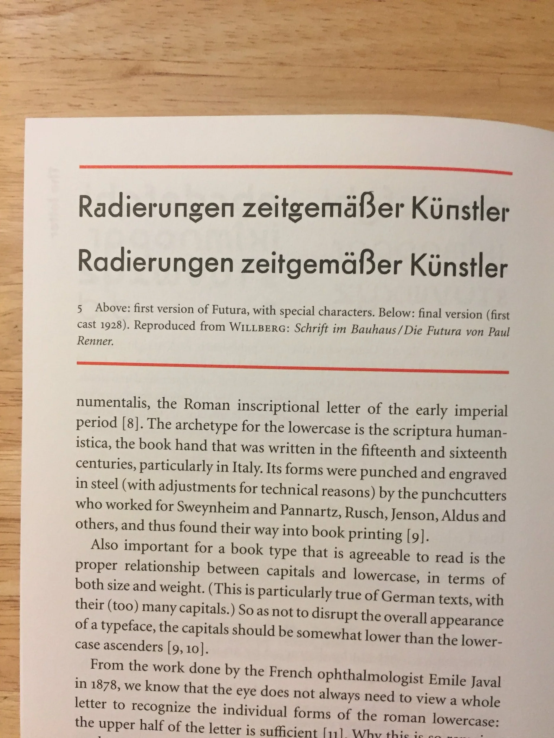
I have also been looking at type choices and I have decided to experiment with using Futura. Futura is a geometric sans-serif typeface designed by Paul Renner and released in 1927. I though that it would be good to use a geometric typeface as it would fit appropriately with my use of the grid and structure.